Lauren MacGuidwin
Product designer
Designing Solv’s design system
Overview
I founded Solv’s design system, Jigsaw, which included 150+ shared components and styles across Figma and Storybook. Over 75% of front-end engineers surveyed agreed that Jigsaw improved the product org’s speed, quality, workflow, and collaboration. Swapping UI components to the new design system improved paperwork completion rate by 2-3x.
Challenge
Our team’s output quality, speed, and impact was suffering without shared components across design and engineering. As a scrappy startup expanding into a new vertical, I gained buy-in to create a design system, but had to build it in parallel with product work.
Process
First, I set a strong foundation by workshopping a set of five guiding design principles, transitioning our team from Sketch to Figma, and auditing existing styles.
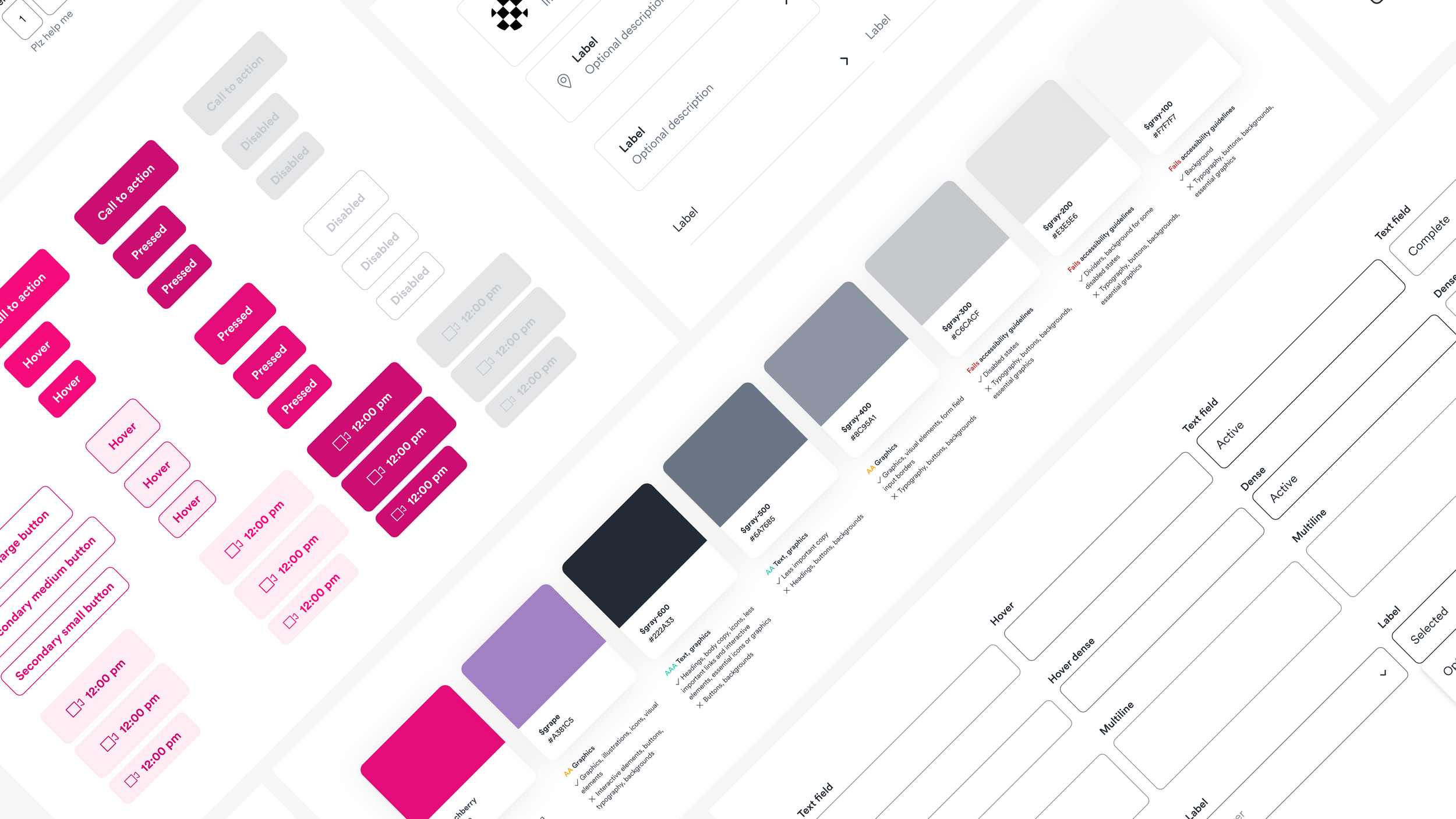
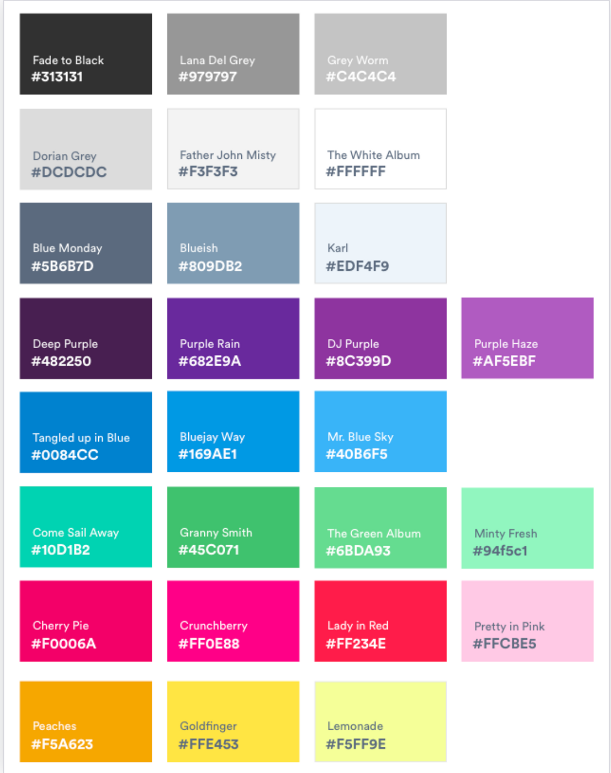
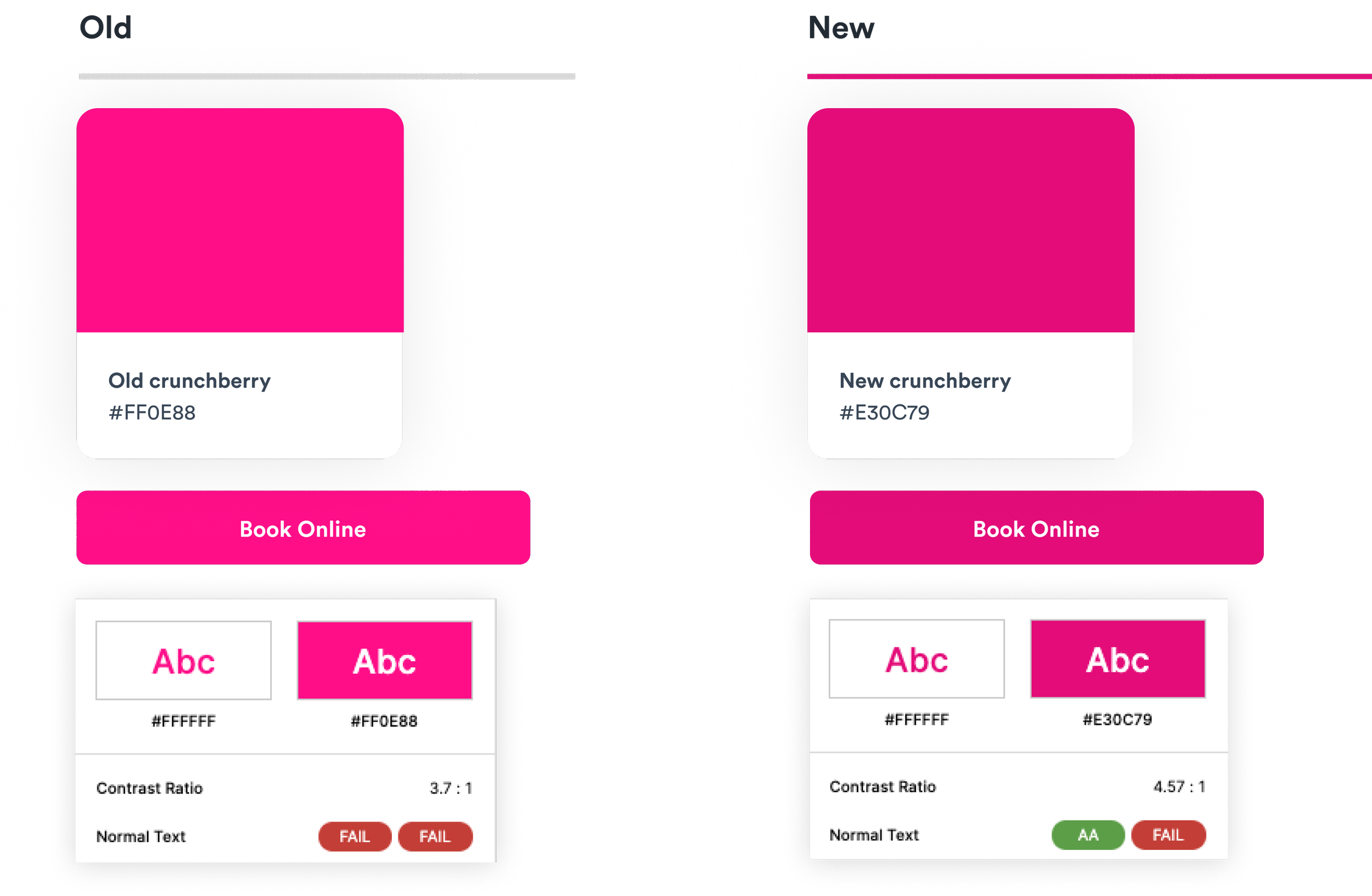
Then, I refined our typography, colors, and spacing to enhance functionality, warmth, and accessibility — even tweaking our beloved primary brand color to meet minimum contrast guidelines.
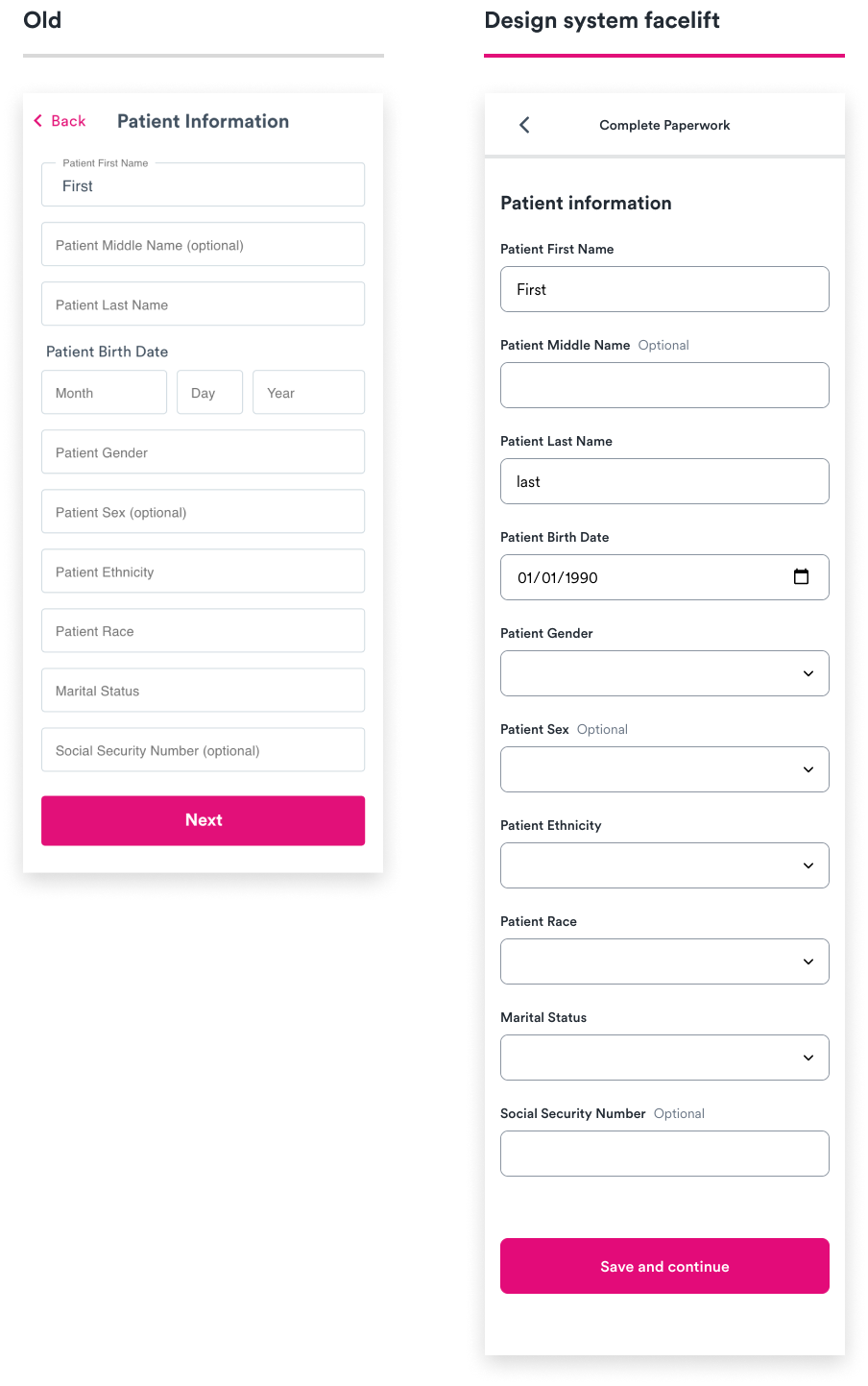
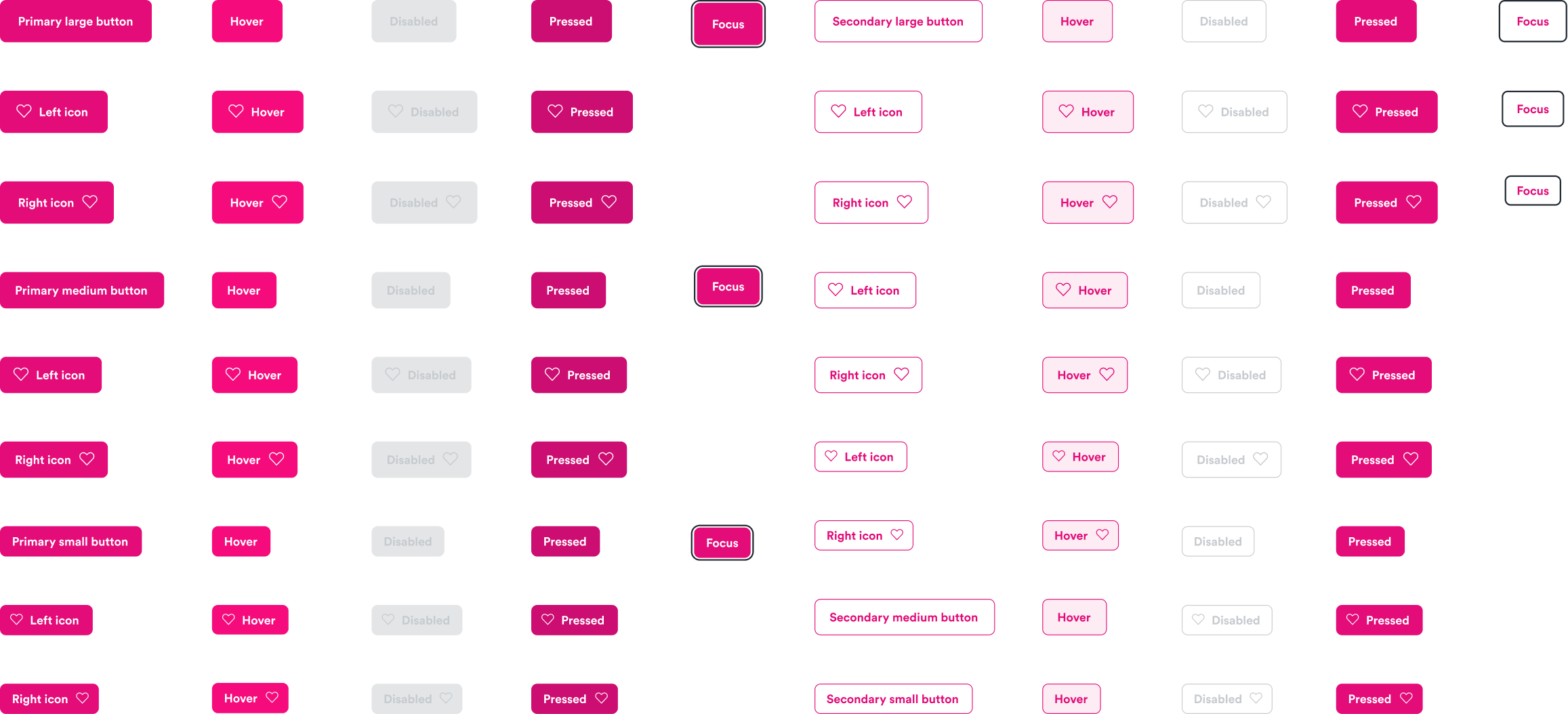
To align with two of our design principles (Warm and Obvious), I adjusted button color and radius, and improved accessibility standards of inputs.
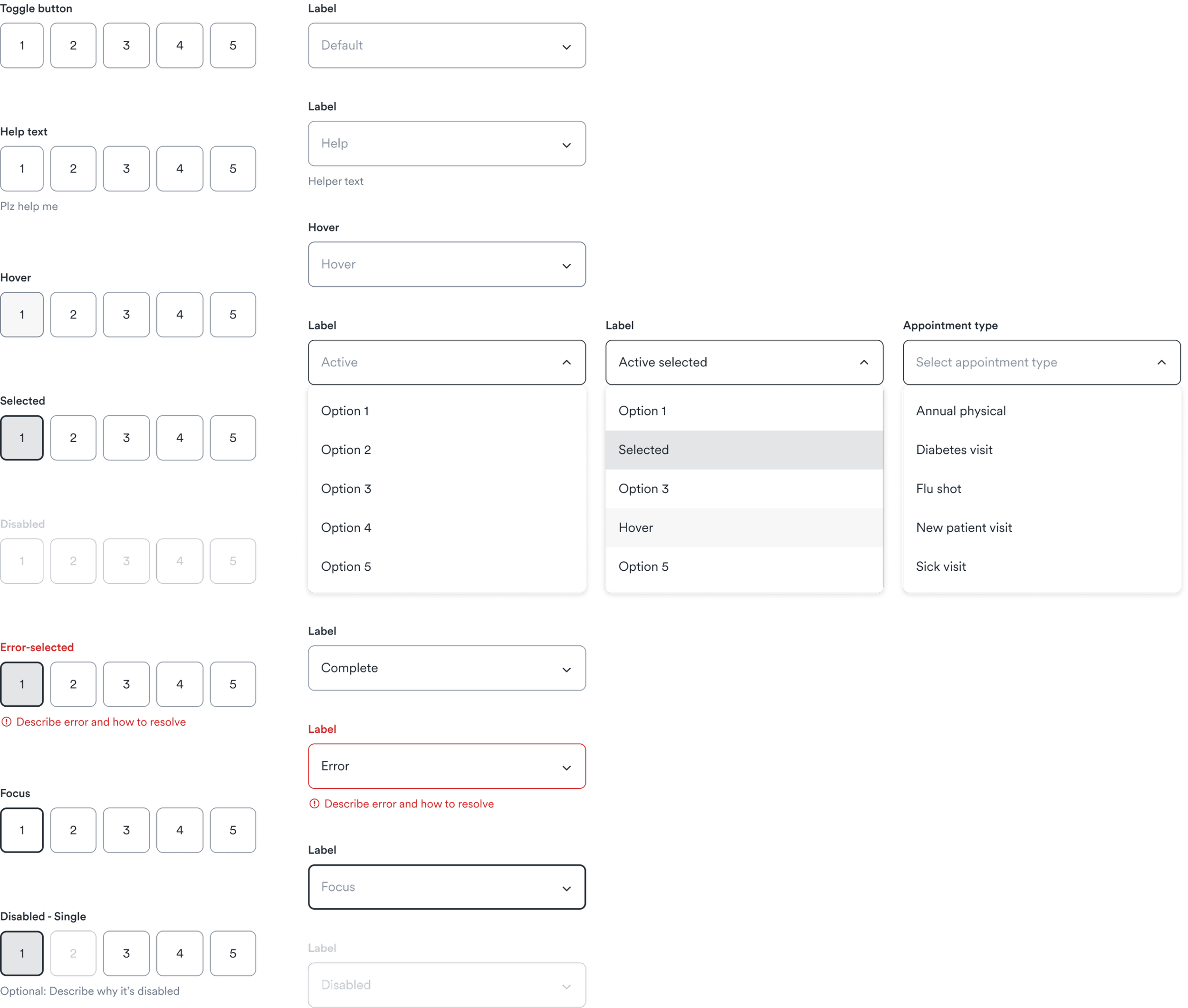
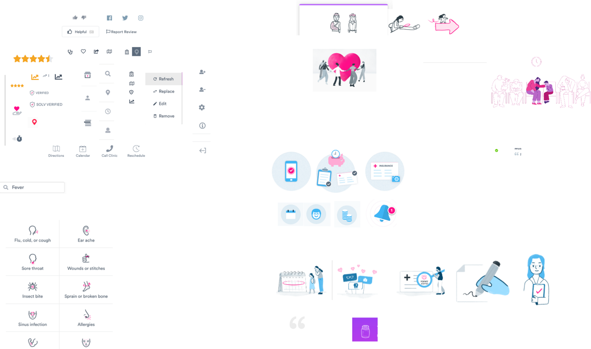
When working on a new paperwork flow, I combined foundational elements into more complex components like navigation, choice cards, check boxes, and tables. I delegated icons and illustrations to design teammates and incorporated them into compound components like form fields, choice cards, and modals.
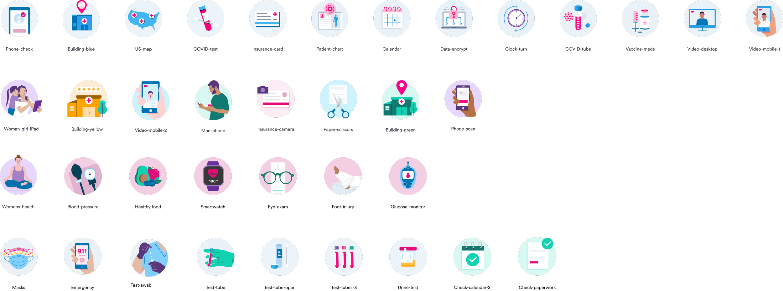
Spot illustrations by Kira Reed
I ran separate biweekly syncs with engineering and design to review progress and share feedback. I workshopped the design system process flow with my engineering partner to document the lifecycle of a new design system component. Eventually, we embedded component creation to share engineering efforts across the team.
Outcome
Jigsaw helped the product org ship better products, faster. Over 75% of front-end engineers surveyed said that our team’s speed, product quality, cross-functional collaboration, and ease of workflow was “better” or “much better” because of the design system. It also significantly improved our design maturity by unlocking designers’ time to collaborate with teammates and serve as strategic, proactive partners.
Swapping UI components to the new design system even improved paperwork completion rates by 2-3x.