Lauren MacGuidwin
Product designer
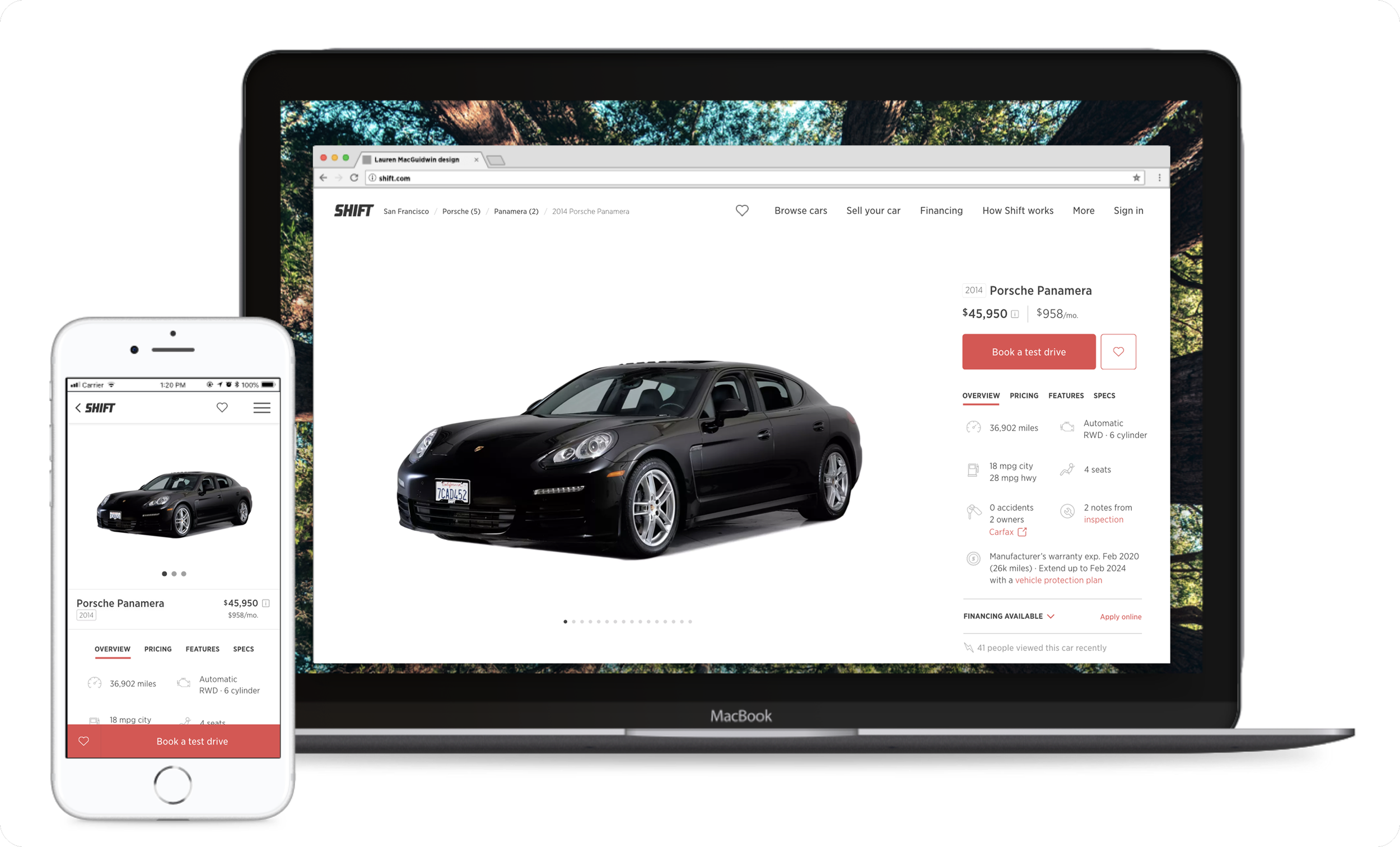
Clarifying the car detail page
Overview
I led research, UX/UI design, and user testing for Shift’s car detail page redesign. The new design drove 25% higher clickthrough rate for test drive bookings and reduced fee-related complaints by 50%.
Role
I led design while working with 1 product manager and 1 engineer.
Problem
Shift received ~10 online complaints per month about “hidden fees,” which hurt brand perception and strained operational costs. The service fee was available online, but had been unintentionally buried on an excessively long detail page.
Challenge
The car page had to be clear and comprehensive in showcasing dozens of important details without creating confusion or overwhelm.
Process
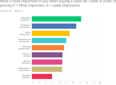
First, I examined existing page data and surveyed used car shoppers to prioritize what car details were most important. I used insights to outline a proposed information hierarchy in a shared doc, collaborating with my product manager to balance user and business needs.
My first design pass featured a detailed pricing card that followed the shopper down the page.
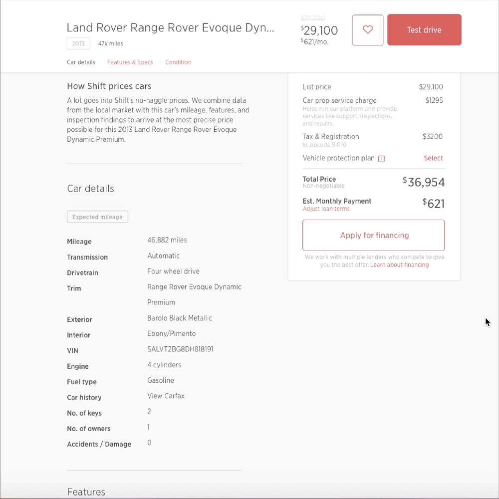
This improved the visibility of Shift’s service fee, but gave too much prominence to pricing at the expense of car information.
Then, I tried adding anchorlinks to a fixed navigation bar so users could scroll or jump directly to a specific section of the page.

User testing respondents understood how to use the links, but still felt a little overwhelmed navigating the page to learn about the car.
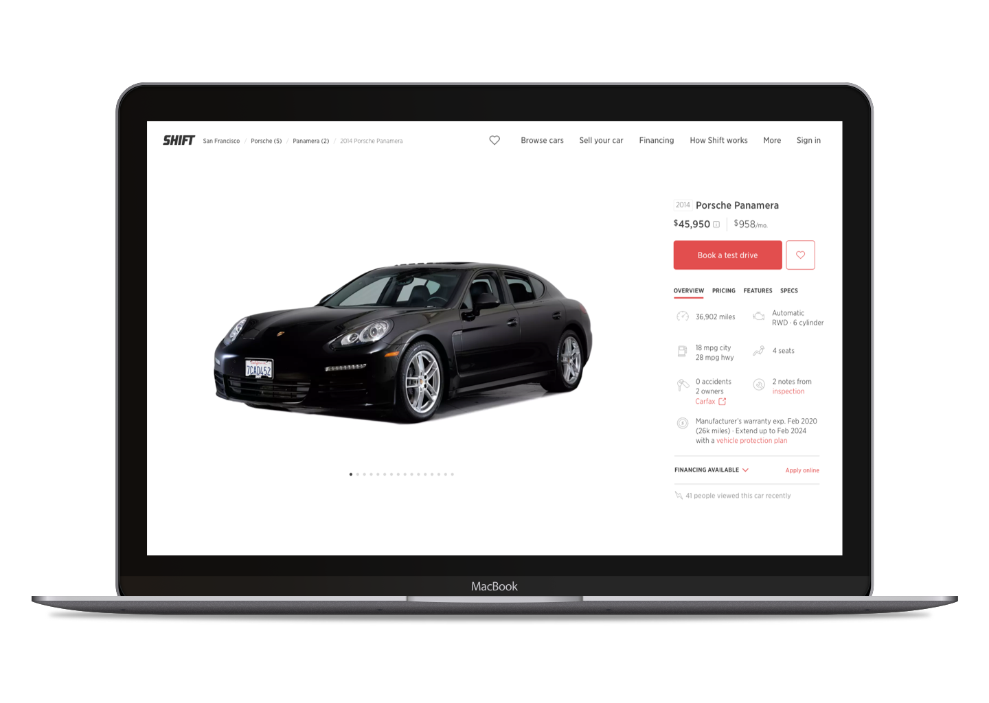
Finally, I tried radically simplifying the page by categorizing all car information into 4 tabs that aligned directly with our initial outline.
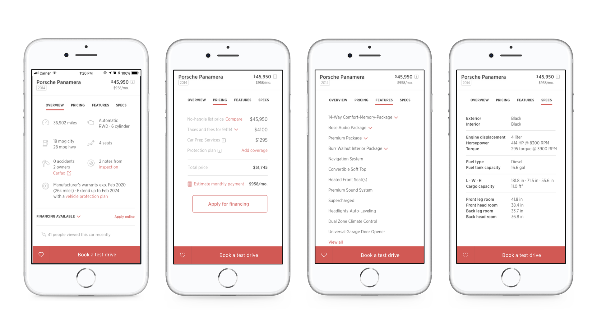
Overview: The key details that were often “make or break” for a shopper’s decision to move forward with a specific car.
Pricing: The full breakdown prioritized by the initial user feedback
Features & Specifications: A smaller, but significant, group of shoppers wanted to know specific car attributes that could impact the price or ownership experience.
User testing feedback was overwhelmingly positive for the design’s simplicity, clarity, and transparency.
“On [the old design], there’s a lot of scrolling. This [new design] keeps all information in one area. I know where to go when I need to look for something. It’s organized in a way that it’s easy to find.”
Outcome
The new page design increased clicks into the test drive booking flow by 25% and decreased reviews complaining about “hidden fees” by ~50%.
“[Shift’s] website is near perfect. Finding the car is nice because you’re not being persuaded ... they have everything you need to know on each car’s profile page.”